| No: 125 |
July 2016
|
News
July Seminars & Heritage Walks
There are no seminars or walks scheduled for July.
August Seminars & Heritage Walks
3: Using newspapers as a family history aid, WEA Centre 8:00-10:00pm
17: Identifying and dating 19th century dating photos, WEA Centre 8:00-10:00pm
24: Discovering Scottish ancestors, WEA Centre 6:30-9:30pm
28: Hindmarsh heritage walk: a town on the Torrens, 2:00-4:00pm
31: Hunting out English ancestors, WEA Centre 6:30-9:30pm
All bookings must be made with the hosting organisation.
All heritage walks are hosted by the WEA.
See the seminar program
for more details and bookings.
Typography
Typography is the art of arranging words on the page. It's central to the publication of printed works and is about much more than making the words legible. Your choice of typeface and how you make it work with your layout, grid, colour scheme, design theme and so on will make the difference between a good, bad and great design.
In this article I can only scratch the surface and as such I am going to deal with those issues that are less obvious but when not used or are incorrectly used tend to set my teeth on edge!
|
In
this issue:
News
July Seminars
August Seminars
Feature article
Typography
|
|
Graham Jaunay
Glandore SA 5037
Australia
genealogy@jaunay.com
Breaking news: 
Services
• Drafting charts
• Locating documents
• Seminar presentations
• SA lookup service
Graham Jaunay uses
The
Genealogist - for UK census, BMD indexes and more online simply because it contains quality data checked by experts.
Proformat News acknowledges the support by  AWE
AWE
|
Let's start with some basics. Firstly we are publishing a book using all the modern typographic principles. We are not using a typewriter. The conventions of typing were designed for the typewriter and yet are still often used with a modern keyboard and computer despite the fact that in today's age the computer, unlike a typewriter, can recognise that the glyphs (that is the letters, symbols and numerals) are of varying widths. Moreover the typewriter was limited by a number of keys. All that is in the past and now we have technology that allows us to produce work previously undertaken by typesetters!
- Insert only a single space after all words and punctuation. Two spaces after a full stop is in the world of the monospaced typewriter!
- Use the correct form of dash rather than employing a hyphen. The longest dash is called an em. It has a special use in writing and behaves rather like a comma but is used sparingly as emphasis. You will also see 2 ems being used in bibliographies to avoid repetition of an author's name. The middle sized dash is called an en and is used to denote the passage of time or link discrete items. The shortest dash is the hyphen and it is used to break words up when they will not fit on a line or to link words.
| Dash type
| Size (traditional)
| Macintosh
| Windows |
Example |
| hyphen
-
| half digit width
| hyphen
| hyphen |
a blue-green hue |
| figure dash ‒
| digit width
| Unicode: 2812
| Used within a sequence of digits: 555‒0199 |
| en –
| width of n
| opt dash
| alt 0 1 5 0 |
Used in place of the word and or the word to:
It took 4 – 6 minutes |
| em —
| width of m
| opt shift dash
| alt 0 1 5 1 |
use in place of a comma for emphasis, instead of a colon or brackets:
Three metals are the substituents—iron, lead and copper. Also used to designate interruption:
“Get out or else—” |
| double em ——
| -
| -
| - |
Indicates redaction:
It was alleged that J—— had been threatened…
Used in bibliographies where author's name is repeated
in a list. |
| minus −
| thinner than an
en
| Unicode: 8722
| 16 − 11 = 5 |
- Use curly commas and quote marks—a nuisance in html but essential in hard copy, a curly comma is important.
- Curly quotation marks can be presented in html – “ and ” – but are rarely used! On the other hand foot and inch marks are not curly!
- Do not underline text. Another hangover from the typewriter but never seen in books!
- Use symbols (that is any text not a leter, digit or punctuation) correctly.
There are a number of other refinements we need to address and while the above are important to recognise before the work is commenced, the following can be dealt with later. Personally I like to set all this up before I start as I find it saves much time in the long run!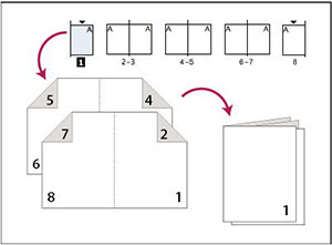
- Ensure the space between lines of text are adequate. Ideally it should be about 120% of the text point size. Thus 12 point text has a 14 point leading. Such space improves the readability of text. Books with few illustrations and other features may require the leading to be as much as 150% of the text point size.
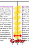
- Ensure you have adequate margins. Most amateurs err on the side of inadequate margins. Wider margins are visually more attractive and add to the balance of text free space on a page. Do not forget to provide a gutter for facing pages to accommodate the book binding. The thicker the book the broader the inside gutter (the inside margins between facing pages). Remember that the margins for books of less than 80 pages is a differing kettle of fish. Such books (really booklets) are usually saddlestitched—that is constructed by simply folding over the pages—and in this case you need to address the issue of creep.
 Thicker books are perfect bound—that is made up of small booklets and thus creep is not an issue! The program InDesign accommodates this problem and places the pages in order when you select 2-up Saddle Stitch when printing booklet. Thicker books are perfect bound—that is made up of small booklets and thus creep is not an issue! The program InDesign accommodates this problem and places the pages in order when you select 2-up Saddle Stitch when printing booklet.
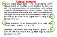
- Employ optical margins to improve the look of your work. To do this you must have a dedicated typesetting program like InDesign. This option appropriately accommodates punctuation occurring at the beginning and end of a line.
- Indent paragraphs but just enough to distinguish without overemphasizing and breaking up the overall look of the page. Traditionally the indent should be the length on the letter m (hence the name of the long dash is em). In 12 point typeface this amounts to 1.6mm. The alternative to indenting a paragraph is a double line but never both!
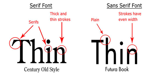
- Avoid using serif free (sans serif) text. The serifs on text aid reading. Restrict sans serif to headings.
- Restrict the length of text in a line. More than 75 characters and spaces is too long for comfortable reading.
- Ensure you avoid words breaking inappropriately with hyphens. Just two letters dropped to the next line is inappropriate. A good layout program will allow you the specify hyphen breaks so that you avoid inappropriate hyphenation on line breaks such as e-valuation and simp-ly.
- If you need to capitalise a word use small caps. Such examples include SCUBA, 54AD, FBI – all best presented as small caps but not here! A small cap is an uppercase letter approximately as tall as a lowercase a. ᴅᴅᴛ spray, 54ᴀᴅ, ꜱᴄᴜʙᴀ tank.
(some browsers and email clients will not reproduce small caps.)
There are other issues to address. Many authors are keen to fully justify the text. That is the text is aligned on both left and right. This can cause problems in scholarly works with lengthy words. You can also end up with spacing running down the page within the text like rivers! You may find an overwhelming number of hyphenated words. Frankly I leave my lines ragged on the right as the effort to address this problem can become overwhelming!
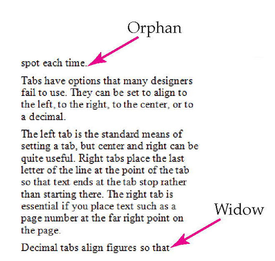
Avoid orphans (single words on a line at the top of a page) and widows (first line of a paragraph at the bottom of a page). These are especially important when they occur overleaf rather than on the adjacent page.
Do not depend on your computer program's spell check capabilities. By all means use spell check but remember we are Australian not North American or British. You will still need to undertake a manual check and while you can do this by reading off the screen, I guarantee you will miss some as there is nothing like printing out and reading a hard copy. Many spellcheckers are uncomfortable with composite nouns and will demand hyphenation such as car-port rather than carport. However such applications are not consistent and can change – today's compound word may have recently been two distinct words and authorities may not currently agree. Is it hair stylist, hair-stylist or hairstylist? Our language is far too complex for many spell check programs. For example how does your spell checker cope with the following perfectly correct examples?
•The well-known author…
• The author was well known.
Compound nouns formerly hyphenated are being merged into a single word or separated into two words. Recently the
Shorter Oxford Dictionary removed the hyphen from 16000 entries—fig-leaf is now figleaf and pigeon-hole is pigeonhole but pot-belly is now pot belly!
If you seek more details on this topic then look at the following websites:
• Book designs basics
• Typophile - a handy downloadable pdf file
• Practical typography - an online booklet on the subject with a good gateway summary
• Creative blog - a listing of technical terms—interesting read but not essential to know
|
To
unsubscribe send a blank email via the following link using the same
address you subscribed to:
newsletter-leave@jaunay.com |
|